Thursday, November 24, 2016

Online comics?

but what about flipping the pages?


I've never really been into comics. I grew up reading one chilean comic Condorito de Oro in Peru, but I only read it on the sporadic occasion that my grandmother visited her cousin who owned the comics. Now the only time I really look at them outside of school is when I come across some cool cover art in the store. Looking at online comics however, made me think about how much I actually like the physical copies even though I haven't really been into hem that much to begin with. I know some people don't really like reading on a kindle or tablet because they simply like holding the book and feeling the pages, and I believe I have been an advocate of reading everything on-the-go on my cell phone, but after looking at online comics I see how one could miss holding the thin booklets and looking at the art in person.

I also thought some of the strips like Nicholas Gurewitch's Perry Bible Fellowship and Pat Mallon's Soopah look more like old memes than comics. 

Also, one of the things that made me want to major in graphic design, and one of the things I love the most about it is print material. All the little booklets, pamphlets, full-sized books, stationery etc. are something I really enjoy about design. Seeing a design come to life and being able to hold it is something very special and I think that translates into my liking of printed comics over web comics. It just simply isn't the same.


All my friends are heathens take it slow

Arkham remix

Reading Arkham Asylum was a very interesting look at a very different very dark version of the beloved Joker. There have been so many versions of the Joker, from the original comic to the latest hollywood interpretation in David Ayer's Suicide Squad. Not having really followed the comic books, my personal experience with the Joker is limited to the films starting which were almost comical until Heath Ledger. In Arkham Asylum, we see a very dark version of the Joker. He is interpreted by a crazed facade in a dark almost impressionistic sketch style. It truly looked very creepy especially because the brightest colors were the red of of his eyes and mouth and subtle blood splatter-like splotches and the green of his hair among the signature black of the batman and the overall darkness of the asylum. When looking at the Joker in other comics and movies, I personally did not really feel as creeped out as I did when looking at this version. Maybe it was because of the other imagery also in this comic, such as a sick lady with spiders coming out of her mouth. 

Another interesting aspect of the comic is the style itself. Dave McKean, also known for Sandman does a masterful job combining photographic elements with realistic illustrations and the crazy creepy cartoonish Joker. This juxtaposition makes the Joker even more scary and unnerving. The latest movie interpretation of the Joker also does a good job at making him super creepy in a new way. He actually seems crazy, not in a crazy evil way, but in a deranged illogical scary kind of way.

Overall, the Joker is a very interesting character that has been interpreted in many different ways and Arkham Asylum does an exceptional job embodying the creepiest side of him. 


Thursday, November 10, 2016

Batman The Killing Joke


1. What was your reaction to the text you just read?

Batman The Killing Joke was an interesting read. I've never been terribly into following the story line of batman but since it is such a big part of our culture I've obviously been exposed to it on several occasions. The one thing I ever figured out was where the Joker came from and this story tells it all. Maybe this is one version of it, but it's the first and only one I've seen. It tells Joker's story from when he became the joker, why he became the joker. The whole concept of him loosing his sanity was very interesting to me. The story shows a deeper part of the character, why he is crazy and why he hates batman. He is shown to want everyone to be like him, trying to prove that anyone can go crazy like he did after a bad day, but failing because the commissioner stayed sane. I didn't really understand the ending but it was interesting nevertheless.

2. What connections did you make with the story? Discuss the elements of the story with which you were able to connect.

The use of the  fair and the freaks to represent "normal folk" and the commissioner as the freak because he was a normal average man, reminded me of the "Freak Show" season of American Horror story which had the main characters and story plot revolve around freaks at a circus. They were really normal folk, and the other "normal people" in town seemed to be crazy and unusual, more so than the freaks. Joker was trying to point this out in an attempt to make himself look more normal, surrounded  by other "freaks" he placed the commissioner in the position of an exhibit at a freak show. He focused not on his physical deformities, but on his personality and morals and social conduct which to him seem freakish. In the same way in American Horror Story, the normal townsfolk had more freakish morals and beliefs and acted more like freaks than the physically different "freaks" at the show itself.

3. What changes would you make to adapt this story into another medium? What medium would you use? What changes would you make?

I would not really make any significant changes to the story to adapt it into my medium of choice which would be film. The only think I would really do is may expand on Joker's background with his wife and his job and his attempt to get a job as a comedian. I believe it would add a lot more depth to the character and make it easier for people to connect with him and have more sympathy. Like the latest movie with the joker in it, Suicide Squad, which gave more background on all the villains in order to make them likable as the protagonists of the movie, making the joker more likable would add interest to the story by making people connect with him and like him even though he is a horrible person. It would drive the point home that he is insane and there is a reason for that and that that is the reason for his crimes.

Thursday, November 3, 2016

Arabian Nights

1001 magical adventures


Arabian Nights is not only a comic, but a collection of stories that have been around since the Islamic Golden Age (8th-13th century). The reason I read this comic in particular is because my grandmother used to tell me these stories when I was a child and I remember her telling me there was a thousand and one of them. She said that her family used to sit around a fire and tell them at night. They were fascinating tales and still are, and I find that every few years I come across them somehow and attempt to acquire some form of the original text to no avail.

Shifting to the theme of this week however, women in comics, the premise of the thousand and one tales is a king that loves to decapitate everyone he marries. One young maiden however saves herself from this terrible fate because the can entertain him every night by telling him one of these fascinating tales. In the end he spares her life, after 1001 sleepless nights for both of them (thats a little more than 2 years and 8 months!). This poor woman has to come up with some kind of crazy story to "entertain" her murderous husband (to whom she was married by force anyways) so she can "keep her head," for almost three years! When do they sleep? Do they sleep? And in the end he spares her life saying that a woman who can outwit her husband for so many nights "deserves" to be his wife. Deserves? Under any feminist concept, this is preposterous, but we have come to accept that anyways. I think it is a little odd that this woman is depicted as oppressed yet thriving and powerful for tricking her husband at the same time as the husband is portrayed as all powerful and dangerous yet dense enough to forget his murderous tendencies because of some story.


Rant aside and despite the background of a terribly abusive and toxic relationship (to say the least), Arabian Nights is a beautiful classic and beautifully illustrated here in a style as classic as the tales themselves.


P.S. Quick shoutout to Prince Achmed!

Asterios Polyp

A Designed Story


Forgive me if if I too often begin with "as a designer I..." but that is how my brain has been naturally wired to think, it has put me in this field of work and art and I see most everything from a designer's perspective. Let it not be a surprise then that as a designer I was truly fascinated with Asterios Polyp. This story of a man looking for his other half, once having had a twin brother (who presently haunts his life in some ways) is told uniquely by simple flat images that contain an incredible amount of emotion. The line quality of the drawings, as explained by the main character even, change depending on who they are representing and the feelings they are having. Asterios has a very structured cold blue form and his sweeter wife has a softer more curvilinear warm pink form. When they get together, these two separate styles slowly mix into a middle-ground purple which takes over their forms and environments. Likewise, when they have an argument, they begin to separate. The lines slowly begin to be identifiable separately and they both end up back as they original selves, pink and blue. At the same time, their environment gets divided as well by the sketchy gestural line quality of her lines and the strict geometrical lines of Asterios.


Another thing I thoroughly appreciated as a designer is the genius use of typography so represent the personalities  of every character. Every speech bubble was different according to who was speaking, and every character had their own font and speech bubble shape. I often have to make decisions of which typeface to use by looking at what other might see as just letters and all the same and trying to figure out what they feel like and assigning them to whatever needs typesetting accordingly. It can be difficult sometimes to determine what font evokes what feeling, and in Asterios Polyp, every characters personality is showcases trough the typeface of their speech.

The successful synthesis of type and image makes for good design, and Asterios Polyp is a story not only told but designed.


Sunday, October 23, 2016

Takahashi and the many halves

A comic about multiple multiple halves


Rumiko Takahashi's manga series Ranma 1/2 is a peculiar and fascinating story about a legendary cursed spring Jusenkyo and how every time a person falls into these waters, they are doomed to become whatever it is that died there when they come into contact with cold water. As crazy at it might sound, this makes for a very interesting series of events since the many creatures that drowned in the springs include many animals and a girl, the latter being the curse of the main character Saotome Ranma.


What I thoroughly enjoy about this story is the many levels of complexity it involves. It is a fairly long story with new characters being added constantly. Every time a new character is introduces, they create some sort of conflict, and every conflict either lasts for a long time or becomes a reoccurring thing that comes back again and again in the most unexpected situations. A lot of the characters end up being affected by the curse which only makes things more interesting especially when the character they end up becoming has something to do with their personality or life story. In the end all the stories are incredibly well developed and end up being intertwined in some unexpected way. All-in-all there is always something new coming around the corner, and the plot is always thickening and getting better with every page.

Even though the story is mean to be fairly comedic, the plot and sub-stories can get fairly serious and inspiring as well as history-oriented. There are many thins to be learned from Ranma 1/2 from teen relationship advice, to urban legends, to ancient history.


Thursday, October 20, 2016

Super cool man...

Fantastic images


Fantastic Planet 1973 is a stop motion animation written and directed by Rene Laloux. It is a story about humans who live in a planet also inhabited by strange blue alien-like creatures that treat the humans like pets. It is based on French novel Oms en serie from 1967.
The imagery and some of the ideas displayed in this film are very interesting and reminiscent of hippie culture. The aliens have this concept of collective imagination and passing on information unto new generations through an out-of-body thought transfer system. Hippies were into the psychedelic and out-of-body experiences like shared spiritual connections and collective thought. At the same time, the strange style of visuals and colors and even the peculiar clothing can be related to hippie culture. Even though they are not exactly the same, the "trippy" imagery is very interesting. The "alien's" physical contortions can also be related to hippie culture. They believed in shared love and would often partake in collective group sexual activity. Also, yoga like practices were adopted and the body as a whole was let out and given more freedom. 


The concept of peace and love is also at play in the film as this human-alien society is at conflict and war throughout the story. By the end however, there is resolution to their conflict and human and aliens are able to live together in harmony alluding to hippie's ideas of peace, all-inclusive love for all, and a sense of community which happens automatically as the humans and aliens come to share their fantastic planet.


Wednesday, October 12, 2016

Feminism

A Struggle Within a Struggle


Satrapi's autobiographical graphic novel Persepolis depicts her upbringing in Iran during and after the Islamic revolution. Although Persepolis is a story about growing up in Iran during a time of great turmoil, the works can be easily analyzed through a feminist perspective. Marjane Satrapi’s particular experience, as a woman, influences the story greatly. Her point of view is different from that of a man’s because of the extreme gender ideologies embedded in her culture. Her story is about her, a woman, growing up during the revolution, but at the same time, growing up in a culture that is notorious for being oppressive toward women. Her experience, and that of all women of her time is not only about the revolution of their society, but their own revolution against sexists standards. Even though Marjane Satrapi has identified herself as a humanist, and not specifically as a feminist, Persepolis can be perceived as a feminist work because while showing Satrapi's struggles during the Iranian revolution it also inevitably, as an autobiography of a woman, shows her struggles against a sexist culture. The story is not meant to be solely a feminist commentary, but there are subtle mentions of this perspective throughout the story.
From the time she is young, Marjane is a very spirited girl and tells us about her dreams of being a prophet, and in one small panel, the prophets comment "a woman?" The story does not elaborate, does not focus on this point but it is still there.

There is more evidence when Marjane's mother is verbally attacked in the street by fundamentalist men who tell her women like her should be thrown in the garbage because she was not wearing a veil.

Feminism however, is not only about women, boys are also targeted in this revolution and sexist ideas are engrained in their minds from a young age. Boys were told that dying in war would merit a reward from heaven and as part of this reward there would be women. This objectifies women and is engrained in boy's minds at a very young age.


Marjane is eventually sent away to protect her as a young woman from the atrocities in her country.

Wednesday, September 28, 2016

Soft Images for a Hard Subject

Art's take on a difficult history


Art has always been a medium for communication, a medium of communication for things that we as human beings have a hard time communicating with one another. Politically charged ideas, tough subjects that no one dare speak of, or subjects that if spoken of directly are not welcome in normal communication. There are just some things in this world that we are not very comfortable speaking about, and art gives us a way of putting subjects out there that we would otherwise keep to ourselves. 

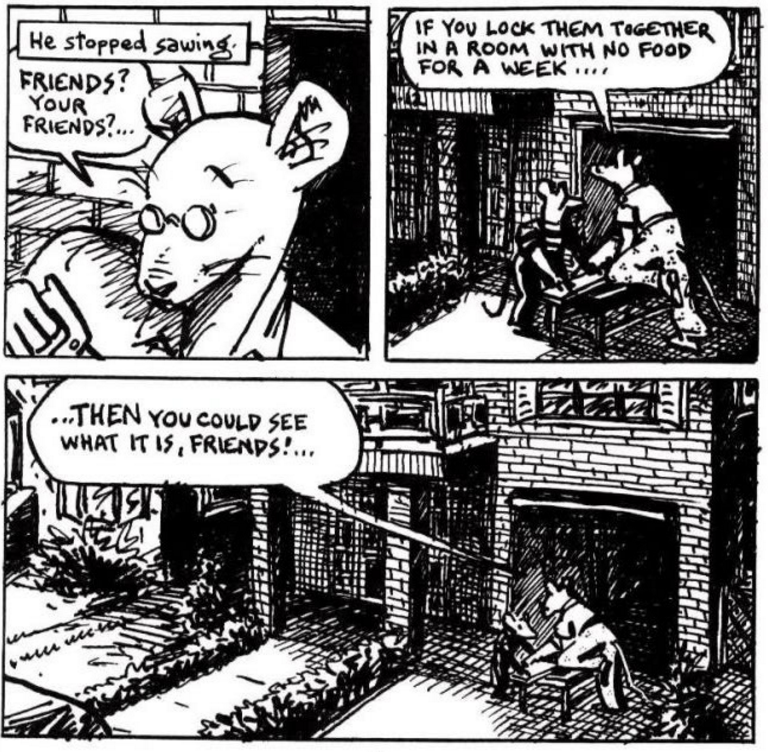
Art Spiegelman's Maus, is one such piece of art that is supercharged with tough subjects and dare we say controversial ideas, that are difficult to talk about. The Holocaust is a regrettable period in global history that is for many a very difficult subject to discuss. Spiegelman writes about it, as many have done, but in the context of a comic. Maus uses animals to express various nationalities, such as the German cats, Jewish mice and Polish pigs. They each have their own symbolism, like the very obvious ca-hunt-mice, but also deeper ones like the fact that the Jews are mice to signify their treatment as a pest or vermin. Besides their literary significance however, the fact that the book is a comic, and the characters are portrayed as animals automatically makes the books for a much wider target audience. People of all ages can be interested in such a story and learn about the holocaust without having to sit through a painful history book (especially us visual learners). The fact that it is told as a biography within a biography also makes it more interesting, relatable and serves as a mood refresher so that the entire book is not about the tragedies of the holocaust. 

All these qualities make Maus a very interesting, fun and greatly educational read for almost all if not all demographics. 

On a personal note, Maus made me think about the painful history of my home country Peru. Peru has a history of internal turmoil between the government a small internal terrorist guerrilla groups. These groups target government officials almost randomly to express their discontent with the government. My family had a very close encounter with one of these terrorist attacks because my grandmother's brother was major of our valley years ago. He was killed by a guerrilla group along with his young son in their home. I have heard the story of how this happened dozens of times ever since I was little and could tune into adult conversations. As a child I remember imaging the story unfolding much like the images in Maus where the bad guys and the good guys were not flesh and blood humans but figments of my childish imagination, aliens, monsters, and animals. As I grew older and came to understand the depth of the story and the implications of it these images turned into realistic graphic portrayals of what had actually happened. Maus does both, by portraying the characters of the Holocaust as animals, yet making the images express the horrors that did happen and are very real to many.

Maus expresses its ideas in a flawless and elegant manner that manages to make the reader see and feel the events without imposing a graphic narrative or visuals making it a true work of art.


Wednesday, September 21, 2016

This s**t is Real Life

Occurrences of Calvin and Hobbes


After reading a few strips of Calvin and Hobbes I came to realize and greatly appreciate how relatable the stories are. Calvin and his "stuffed animal" tiger friend Hobbes engage in interesting situations of every day life and give them a humorous twist. Calvin is a very small child, yet his voice in the comics is a little above his age level (his vocabulary is also of an older and well read person). Him and Hobbes act like children, but sometimes like a pair of best 30-somethign-year-old-friends.


They are about every day life situations with a twist and sometimes things that we wish we could to in real life happen as if they were incredibly normal. The characters, like Calvin's mom and dad also act almost intuitively speaking their minds on every subject, bringing a level of honesty to the strip that makes it very engaging and relatable.

Another interesting thing about the comic series is that they are very similar in purpose to today's "memes." They are short snip bits of every dar life and they express what we may be feeling in some situations but never actually say like when Calvin daydreams about whoever is speaking to him as a space alien that he is battling. I can see a meme that says "that moment when you're getting yelled at and you space out." I can see this being the origin of those pop-culture icons we know today and it is very interesting to see how they were made and distributed before.


Wait what...?

comics for dirty geezers and classy ladies


When I started to read the Tits and Clits comics I did not realize they were authored by women. They seemed pretty scandalous at first. I thought, who could be the intended audience? but after settling into the theme and getting over the fact that they were explicitly sexual, I came to realize they were fairly real stories that could be entertaining and even comical in a clean way. By real I mean they were not like the Young Romance comics where the women were objectified and the scenarios were pretty ridiculous at times (evidence of the minds of the male authors behind them). These comics, as explicit as they are, seem more real than the Young Romance comics, they are about things that aren't talked about and that if they were talked about they would probably not be talked about seriously. My first year of college I attended Simmons College in Boston, an all women's school. There I learned that talking about certain subjects can be serious and carefree in an all-female environment. Seeing that the authors of these comics are all female, it made sense to me how they have a genuine voice without judgement or condescendence. It was almost refreshing to see this subject matter presented in comic form, in such a simple and carefree way. Even though at first glance they might seem crazy and overly sexual, the stories can potentially be relatable and fairly entertaining to many readers of all genders and sexual orientations.


Thursday, September 15, 2016

Design and Type

words are pictures too


As a graphic designer and typography fan, I thoroughly appreciated Will Eisner's comic book layout and his incorporation of type, not only as a medium for communicating his story verbally, but as an element of design in itself. Comics are characteristic stories that use images, drawn pictures, to make up their narrative. The words are (not always present) there to help the narrative, not necessarily as a visual element (although it becomes one by default). Also, they are known for their "comic strip" layout, with the sequential artwork laid out within straight panels. Although the panels are indeed used as elements of design, and have a significant impact on the movement of the story, I have come to see them as a motionless grid that keeps me from exploring the page. 

The works of Will Eisner that I looked at this week, step away from this grid and play with beautiful composition that makes each page have a life of its own. 

One work in particular, Contract with God, is a masterpiece in itself. It does not only break the grid, but incorporates typography into the narrative as a visual element. In this work, Will Eisner is not only a comic book artist and writer, but a graphic designer. As one, I greatly appreciate the care that Eisner places into his work. The separation of thought/word bubbles and images in traditional comics is slightly irksome to my designer eye, and Eisner raises the bar incorporating the text into the compiles images without a grid.


Friday, September 9, 2016

Caught in a Bad Romance

The male gaze writing for the female gaze


Simon and Kirby's romance comic series Young Romance is an interesting look back to a time when the gender gap was abysmal. The stories are meant to appeal to the young female audience, one that was not and maybe has never been a very big part of the comic book/comic strip world. Keeping in mind that back in those years it may not have been as uncommon as today to see a fairly young girl (in her late teens) to be involved with an older man (in his thirties) the stories are still very objectifying of women. They were thought up and written out by men, probably older men whose fantasies and sexual ideals are clearly evident in the comics as opposed to the ideals of the audience they were directed toward.


It was interesting to see the extent of the comic series and how it was fairly successful despite its shallow nature. All that aside, I was very intently reading the stories, almost getting wrapped up in them like an intense soap opera. It was probably because of the shock factor, everything about the comic that I found preposterous like the age of the men and the carelessness of the women that kept me interested and kept me asking: what craziness will happen next? I feel that this is because of my latin background that I find confounding soap stories entertaining, but I also find interesting the fact that these were a serious part of pop-culture in their time. I do wonder if the women reading these decades ago were entertained by them for the same reasons I was or because they played into those male-gaze centered ideals that are so clearly displayed in the comics; if they believed that this was laughably entertaining, or if they believed in the stories and the ideas they communicated because of the society they lived in.


Wednesday, August 31, 2016

Dreaming of Composition

A small peek into layout insight


This week I had some interesting times with critiques in graphic design. Currently working on a poster that conveys several meanings of one word has given me some challenges. I've always thought composition is every intuitive, and it is, until you have to think about a specific message you want to convey and then you get into the very technical aspect of composition, where the very placement of a visual element means something, or can be used to drive forward an idea you are trying to get across. In Winsor McCay's Little Nemo in the Palace of Ice, I saw a narrative of dream-like proportions which was greatly aided by compositional elements. It tells a story of a boy in a land of dreams and adventure, quite literally the adventures of his dreams. 


Maybe composition is not as obvious a component in comic books as it is in graphic design, but the simple size, placement and shape of the comic strip squares, play a big role in moving the story forward, and the direction of the narrative. Instead of panning and zooming, like what would happen in a movie, and using size, and placement, much like in graphic design, the panels of the comic strip serve to accentuate certain scenes and points in the narrative.

Within each panel itself, the style of drawing is very dream-like. The foreground and background seem to blend together in a harmonious fashion as it would in the haze of a dream, yet the line-work sets apart the action from the setting. In this same way, when working on my current design project I had to think about every single definition of that word and make sure it stood out on its own, as well as make everything look like one coherent and complete image.